Monday, 6 March 2017
Sunday, 5 March 2017
Final Ancillary Tasks
Album Cover:


For the album cover, I went for a simplistic approach. I very strongly focused around the colours of paint used in the music video. For example, on the front cover there is a completely white background with the words 'Fix You Coldplay' written in a black outline (the idea here is that the audience can colour this in as colouring is a theraputic thing, often recommended for people with mental health problems) and then two finger prints at the bottom where people would naturally hold a CD, one fingerprint is pink and one is yellow as these were the colours used in the music video. On the inside of the album cover, I decided to have one side splatted lightly with pink paint and one with yellow, once again reinforcing the music video. As for the back of the album cover I just simply listed the songs that could be found on the album with no paint at all, as I felt this was an appropriate way of linking the end of our music video to the end of our album cover because in the video the idea that if you share your problems they will become easier to cope with which is why there is no paint on the back cover.
Overall, our digipack confides to the norms and conventions of digipacks by having the album name and artist in big letters and having the song list on the back. However, the idea of having an album colour with an area for you to colour in challenges a lot of conventions and is not commonly found on digipacks.
Poster:

For the poster, Olivia and I splattered the paint across a white background in order symbolise a very busy and chaotic case of mental health taking over what would otherwise be a very simple life, however we also wanted there to be a lot of paint on the poster to really enforce the idea into the publics minds and therefore make them remember it. We made sure that we kept the lettering of 'Fix You Coldplay' clear of paint so the white background was still clear to some extent, this idea was also quite creative. Annie then added a release date, some logos (youtube and apple itunes) and a hashtag (to get people talking about the music video on twitter to increase the social media platform of the video) to the final version of the poster on Photoshop as this follows the normal conventions of a music poster. She chose to write in plain black so that it didn't distract from the poster but so that it also stood out.
Overall, our poster does follow the normal conventions of media product posters as this is what is expected in society.
Saturday, 4 March 2017
Evaluation Question 1
In what ways does your media product use, develop or challenge forms and media products?
Friday, 3 March 2017
Evaluation Question 2
How effective is the combination of your main product and ancillary tasks?
How effective is the combination of your main product and ancillary tasks?
It is very important that the main product and the ancillary tasks have similar themes running through them as this is what makes them distinctive as a brand and this brand will then become recognisable to the target audience and other members of the public. Ancillary tasks should reflect what the main media product is about as they are promoting this main media product (in this case; a music video). They are a key way of advertising the music video as ancillary tasks are often things like CD covers, posters or magazine advert and this means that they are tangible products that can be found in shops or on advertisement boards and this will widen the audience to people who may not have access to the internet and therefore wouldn't have seen the hype or any online advertisement for this music video. Another way of increasing the effectiveness of the link between your main product and ancillary tasks is by using a form of synergy between all three products to promote the music video and therefore increase the videos views and sales, this is the overall aim of creating ancillary tasks.
In our music video we focus on the issue of a rise in mental health problems, especially with teenagers, and how people feel as though they can't share what they are going through with other people and the idea that they are all alone and the world is against them. When researching about mental health we came across a campaign advert that used a dog to represent the mental health problems, some days the dog was harder to walk because it was too big and other days the dog was smaller and therefore much easier to walk. We wanted to represent mental health in a similar light as this to get across to the public that mental health isn't the same for everyone and that it in fact differs in one persons case, in the way of being worse on one day but easier to cope with the next. As a group we decided to use paint to represent the mental health problems as we thought that this would be something that people would remember when watching a music video and therefore would increase the talk about the music video.
Due to using paint in our music video, it was incredibly important that we had the paint as the main concept running through all of the ancillary tasks as well. For our media product we had to make an album cover and a poster. For the poster we splattered the paint across a white background in order symbolise a very busy and chaotic case of mental health however we also wanted there to be a lot of paint on the poster to really enforce the idea into the publics minds and therefore make them remember it. For the album cover, we went for a much more simplistic approach. We very strongly focused around the colours of paint used in the music video. For example, on the front cover there is a completely white background with the words 'Fix You Coldplay' written in a black outline (the idea here is that the audience can colour this in as colouring is a theraputic thing, often recommended for people with mental health problems) and then two finger prints at the bottom where people would naturally hold a CD, one fingerprint is pink and one is yellow as these were the colours used in the music video. On the inside of the album cover, we had one side splatted lightly with oink paint and one with yellow, once again reinforcing the music video, creating an effective link for the audience. As for the back of the album cover we just listed the songs that could be found on the album with no paint at all. We felt that this was an effective way of linking the end of the music video to the end of the album cover as we tried to portray in the video that if people share their problems with others they would realise that they are not alone and that their problems would actually become easier to cope with if they had help and support from other people going through similar things and this is why there is no paint on the back cover.
Another thing that allowed for an effective combination between our main product and our ancillary tasks was that we always started with a white canvas. For example, in the music video, the characters are always seen wearing white t-shirts that have paint splattered over them and we wanted to take this idea into the creation of our ancillary tasks to allow the audience to see another link between all three products. On the poster we started with a white background, then splattered the paint but made sure that we kept the lettering of 'Fix you Coldplay' clear of paint so that the white stood out at the end and that the audience could see that underneath it all was a white background. Finally, for the album cover there is a lot of white background that can be seen with simply the colours of paint used in the video splattered across it. The white backgrounds in all three products are an effective way of showing that all three products represent the same issue in society and therefore are an effective way of advertising the main product to the public.
Thursday, 2 March 2017
Wednesday, 1 March 2017
Saturday, 28 January 2017
Audience Feedback On Final Cut And Ancillary Tasks
After a long process we finally had a final cut to show people and gain their feedback. We are very happy and pleased that overall the feedback we received was positive and the majority of people understood the deep meaning behind the music video. Although most of the feedback about the CD cover was positive we did receive several negative feedback points where people thought that the cover was too basic, however when we explained that the reason behind this was so that people could colour it in and make it individual to them (much like mental illness) they felt that this worked well with our idea. A criticism we received about the music video was that during one of the time lapses the bus appears on the screen for too long blocking the view of the female charactor. Although, once again we justified this by saying that the bus shows that everyday life is still going on around the characters even though they are suffering.
Monday, 16 January 2017
Audience Feedback On The Rough Cut
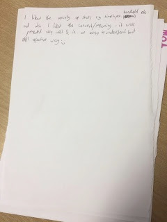
We asked class members and family members to watch our music video and write any comments they had on a piece of paper so we could see if there was anything we felt we needed to change as a result of the feedback. Below are several images of some feedback we received:


Overview of feedback:
- we had a range of feedback regarding the time lapses, both positive (very effective) and negative (too long), however all members of our group and our teacher felt that the positive effect the time lapses had on the final product outweighed the negative comments and therefore we decided to leave the time lapses as they were
- people thought that the meaning behind the music video was very powerful and relatable
- the paint was considered a creative representation of a way of portray mental illness
- a lot of people were not keen on having the fact at the end of the rough cut as they felt it was unnecessary and as a result of this we are going to take the fact out of the music video, meaning that the final cut ends on a time lapse of both actors
Thursday, 12 January 2017
Sunday, 8 January 2017
Filming Review
Filming location one: Charlie's part (All filmed in one day)
1. What worked well?
Charlie was a really good actor and took his role seriously, he also came up with his own acting ideas what he thought would work well what was very useful, such as Charlie came up with the idea to get in the bath and make it look like as the shower run the pink paint was coming off of him.
2. What didn't work so well?
One of the locations was supposed to be Charlie in his bedroom as he wakes up and gets dressed, however as we filmed in my house the only boys bedroom w could use was my eight year old brothers therefore it looked very unrealistic that was a eighteen year old's bedroom.
3. Anything that could be re filmed?
Once watching the footage back I realised there was quite a lot of shots that were filmed where you could see other peoples feet in the background as well shots where you could see the paint tub in the background which makes it look really unrealistic.
4. Did everything run smoothly?
Other than what was mentioned above everything ran very smoothly, despite the fact paint got everywhere and my mum wasn't too pleased.
5. Did you use your storyboards to good effect?
We didn't really us the storyboard as it wasn't in great detail, however the script we used to good use as it was in good detail and outlined the basic idea, including what shots to use.
Filming location two: My acting part (filmed at Olivia Wilkinson's all in one day)
1. What worked well?
It was good because the weather on this day was the same as the weather on the day of filming charlies part so it looked realistic that both scenes were happening at the same time in different locations.
2. What didn't work as well?
I was only used as an actor because it was convenient, however I didn't feel very comfortable around the camera and from looking back at the footage I think it was evident.
3. Anything that needs to be re filmed?
There is nothing that particularly needs to be re filmed, however there could be more close us shots of my facial expressions to show I am getting angry and frustrated.
4. Any ideas you got as you went along?
Most of this idea was made up there and then as it was quite last minute that I was going to be acting.
5. Did you use your storyboards?
No we did not use the storyboard created, instead we discussed as we went along and came up with ideas.
Filming the running shots around town and shooting the time lapses;
1. What worked well?
Yet again the weather was the same so it looked realistic how the actors went from running out the house to running in the town despite it actually being on different days.
2. What didn't work as well?
It was really cold and I was in a vest top so it was freezing, therefore we had to film quickly and we couldn't re film some of the extra stuff was wanted to because it was just so cold.
3. Did everything run smoothly?
Like mentioned above it was cold and as everything was filmed outside it woulds be hard to re film some parts without the weather being the same.
4. Any changes you are making?
I think we have all the right footage, however we will see when we start making the video.
5. Any ideas you got as you went along?
We had the basic ideas of running through town and the time lapses in town however the decided the exact locations to film this when we got to town and had a look aorund. The part the end where the camera spins around me and Charlie was an idea that me and Olivia came up with on the day.
6. Did you use your storyboard?
We knew what we wanted to achieve so we didn't need to use our storyboards.
Monday, 2 January 2017
Images Whilst Filming


Explaining these images:
- Picture one shows some of the equipment used. This image shows a tripod with iphone in. We used an Iphone for the convenience. This shot shows a camera on the sink so make it look as though the camera is the mirror.
- Picture two shows me putting the paint onto charlies fingers which was used many times in shots such as in the picture above, when charlie whips his face in the mirror the paint goes onto his face and when he washed his hands in the sink and also when he picks up objects the paint transfers from the palm of his hand to the object, such as in the kitchen when he picks up the cup and drinks bottle.
- Picture three shows a different piece of equipment used, this is a different type of tripod that you put on your shoulder which is used for moving shots, we used this tripod for shots that were from the actors point of view, such as the running shots.
- Picture four and five are pictures taken whilst filming in the town centre.
- Picture six is a picture of Charlie with the paint on his face looking into the camera. This shot will be used in our final cut as it is a clear indication of the paint (representing mental illness) interrupting their daily lives.
Subscribe to:
Comments (Atom)